I’m slowly recovering (physically and mentally) from my broken femur, and my priority is working on my comic book for Kibitz editions! I initially thought I would provide the storyboard by mid-February, or at the latest by the end of the month, but under the circumstances I made virtually no progress until mid-March.
A comic book will often begin as a written script, which may include layout (pages, panels) and/or staging instructions; how much will depend a lot on the relative experience of writer and illustrator, and on their relationship. But as I am both, I think I can best show how the story unfolds by working directly in comic form – using a simplified drawing style to be fast, and thus being able to try different things, and to make corrections. That so-called storyboard must still be readable enough for the editor who will review it 😅️.
Here I’ll show you how I made my own storytelling changes after giving it some thought!
Art in March: comic book storyboard, searching for the right storytelling
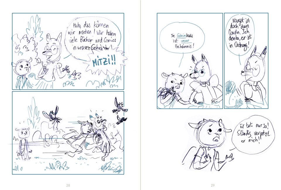
Here are the initial pages (sorry they’re in German, but I think it shouldn’t prevent from understanding my point ;)).
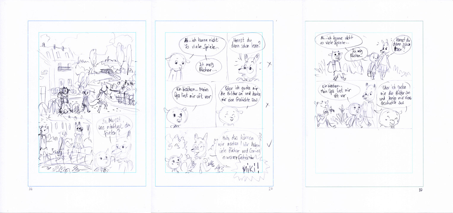
The first row of pages already shows a first example. On page 27 (in the middle), for the dialogue I had shown the face of the person talking. That’s clear and shows off the facial expressions, but it can soon get boring. But mainly I missed showing Loukoum’s reactions (he’s the goat-boy, the main character). He’s not too happy that his young cousin Nougat is staying with him for the holidays; he has bad memories of their last encounter, and he’s also not used to sharing the attention of his parents, or here of his friend Mitsi.
So I modified the first two strips, as shown on the right. I put the final page together digitally, as well as making some changes on page 28 (you can the the arrow reminding me to swap 2 panels, plus I wanted Loukoum and Mitsi to be further away from Nougat on the first panel).
I can’t show you that stage because I did not record it 😅️.
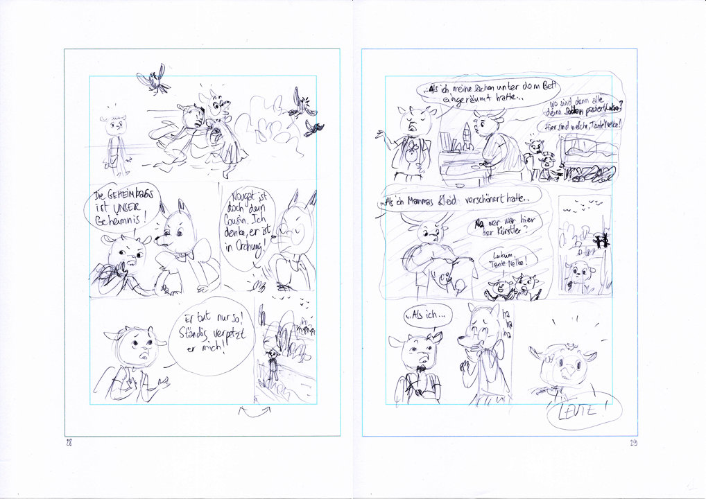
Indeed, the more I thought about it, the more I felt that these pages were too dense. The idea is that this comic is for children who are still learning to read, or who aren’t very confident readers.
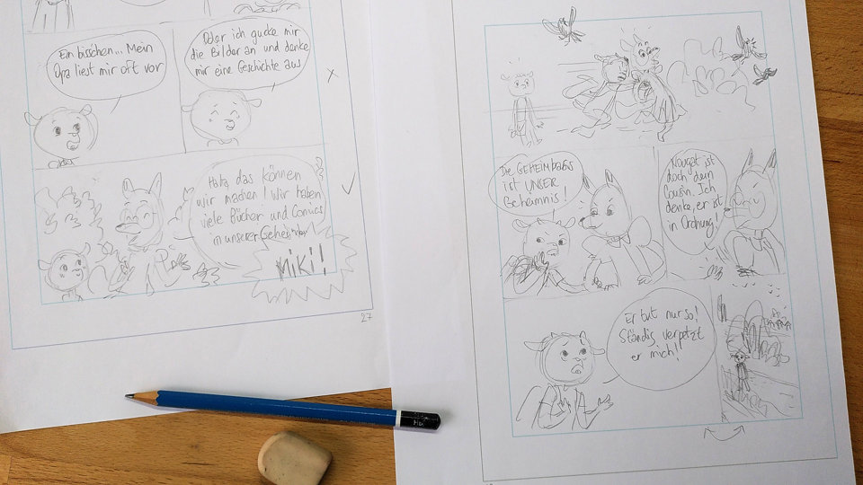
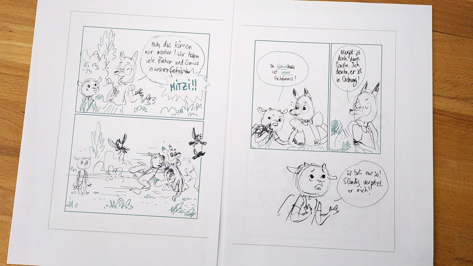
It took me a while to pluck up my courage, and another to think about what I could do about it. And finally I found a solution, and the 2 spreads have become 3!
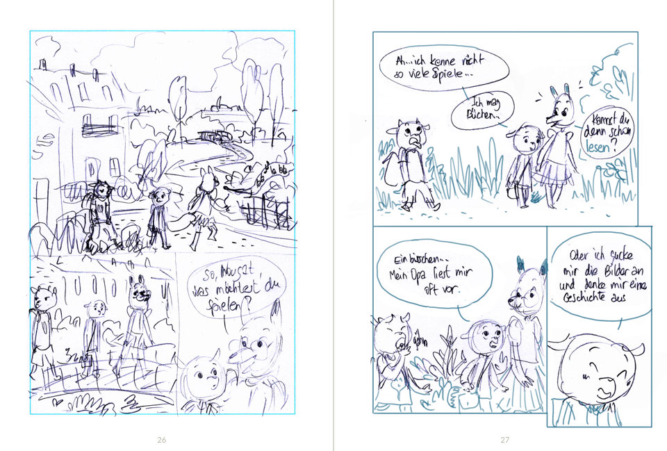
Before doing the 3rd one or working on the next spread (which I had already scripted in a similar way), I printed the first 2 to check whether it worked at the actual size and on paper (I think it does ;)).
From my camera roll: spring, indutrial, abstraction
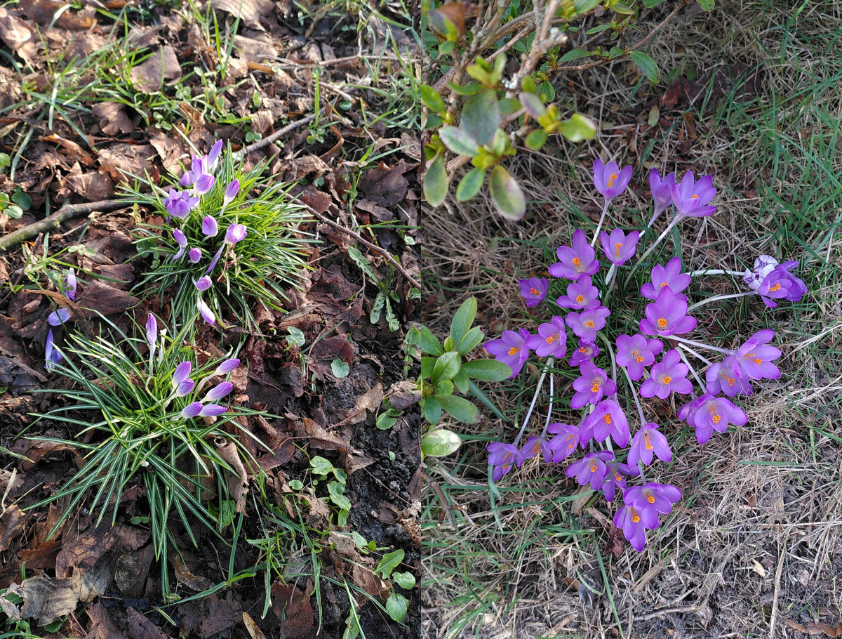
Signs of spring :)
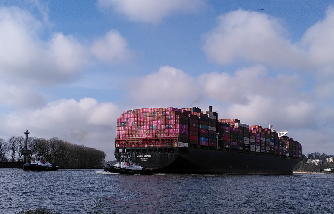
In Hamburg’s harbour, 3 tugboats manoeuvre a container ship. Impressive!
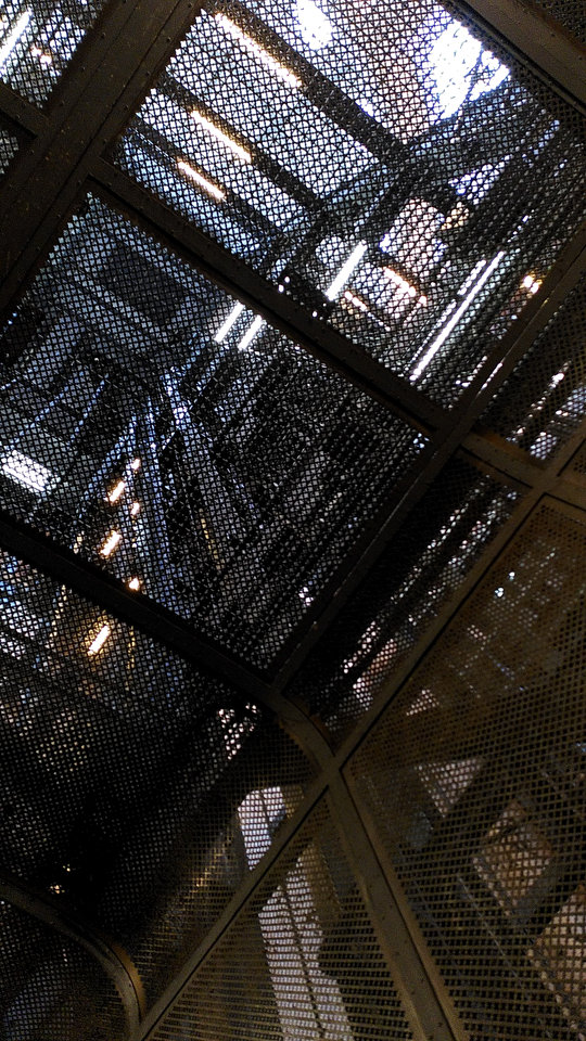
Lines, hatching, pools of light – a near abstract composition in the goods lift between the Old Tunnel under the Elbe river and the surface (also in Hamburg).
Inspiration: Ulla Thynell
Some time ago I wanted to have a mouse pad printed (with an own design). I hoped to find some on Society6; in fact they only have large “desk mats” which I’m not interested in (and now they only deliver to the US anyway…), but before understanding that I scrolled through the designs they offer and noticed one artist especially: that was Ulla Thynell. I then remembered being introduced to her work some time before (like I am doing here ;)) in the newsletter of Swedish artist Louise Stigell, and already falling under her spell at the time :)
While browsing Ulla’s work I even realised that I had already “met” her much earlier, back in 2018, in the great traditional-drawing magazine Graphite (which sadly lasted only 10 issues 🥲️).
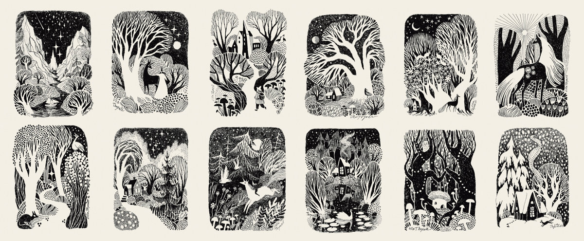
I like Ulla’s black and white illustrations a lot, with their dreamy forests and their play with lines, pitch-black areas and negative space. These are from her 2026 calendar, which I was given for Christmas 😊️.
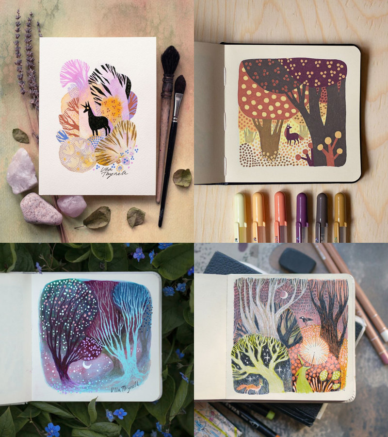
But what makes Ulla an essential source of inspiration for me, are her recent works in colour. She wrote an article full of insights about them on her blog.
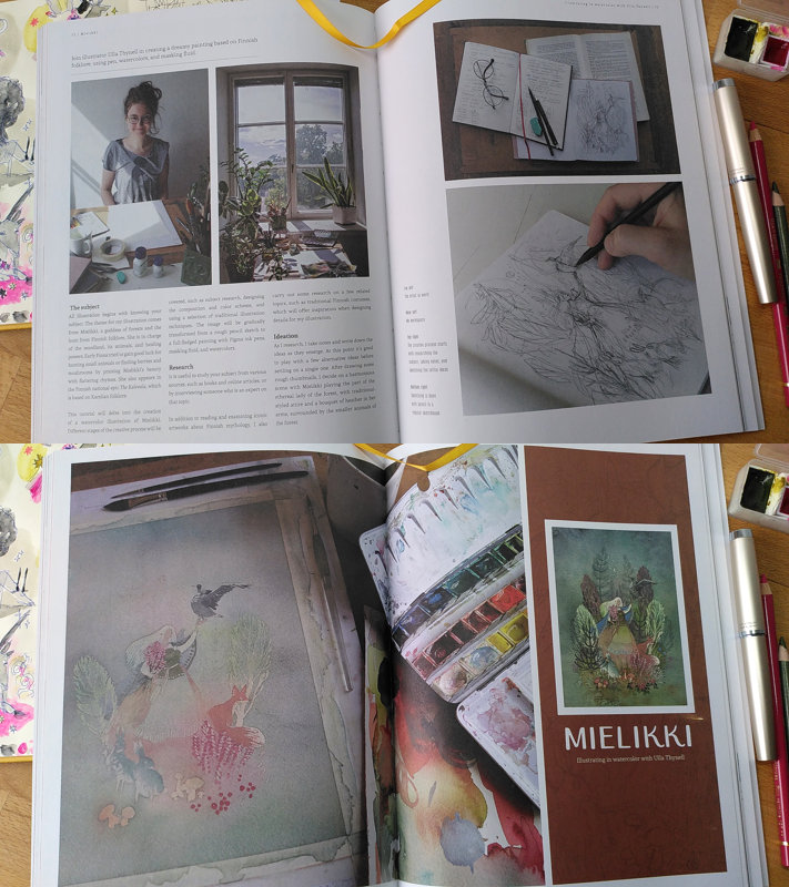
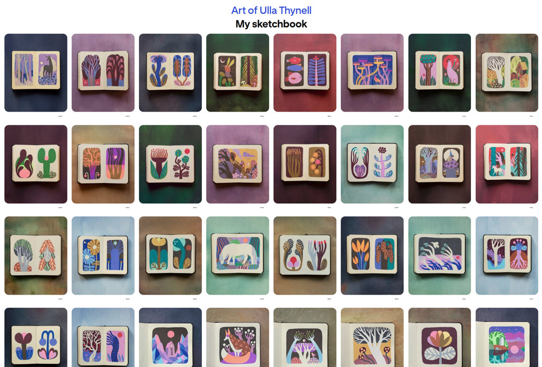
This is a recent screenshot of her Pinterest collection of “sketches”. I could spend hours entranced either by the overall collection or each one of these little gems of creativity in terms of form, composition, colour palette, and more. Wonderful!
Here are 3 examples to give you a closer look, plus an original painting. The way she stages the photos is an art form in itself! Her photos, examples of which can be found on Instagram or in this article on her blog (astrophotography!), are just as captivating as her drawings!
That’s it for this month!
As always, if there’s anything you would like to ask, something you would like to read about in the next letter, or anything really – send me an email at hello@reinekurth.com! It would be lovely to hear from you 😊.
With love,
P.S.: Would you like to receive the next letters directly, on the last Friday of each month? – not to mention a 15% discount on one order in my shop? ✨ Welcome! This link will open a pre-filled email – or you can simply write a message to subscribe at reinekurth dot com, ideally with “SUBSCRIBE” in the subject. If you’d prefer to get your letters in French or German, add a note to the message. Then just click Send, and I’ll take care of the rest! ✨ (no third parties nor tracking involved 😎)
P.P.S.: Not sure yet? On this page you can read more about what to expect, and under the #letterfromthestudio tag you can read the already published letters (they are published on the blog a few days after being sent to subscribers).
Also, if you prefer to check out with me on your own terms, you can subscribe to the RSS feed of “Letter from the studio” in your favourite RSS reader 😎